


For the past two years, I’ve been aware of gradients’ growing presence but hadn’t really thought about them much. Gradients, for me, were a classic example of the Baader-Meinhof phenomenon—that thing that happens when you notice something that is new to you and then you start seeing it everywhere. I was taking an online course on Photoshop and the instructor said that usually, he wouldn’t cover gradients since they’ve often been viewed as tacky and designers weren’t interested in them but, since they’ve made a recent come-back, he felt he should cover them.
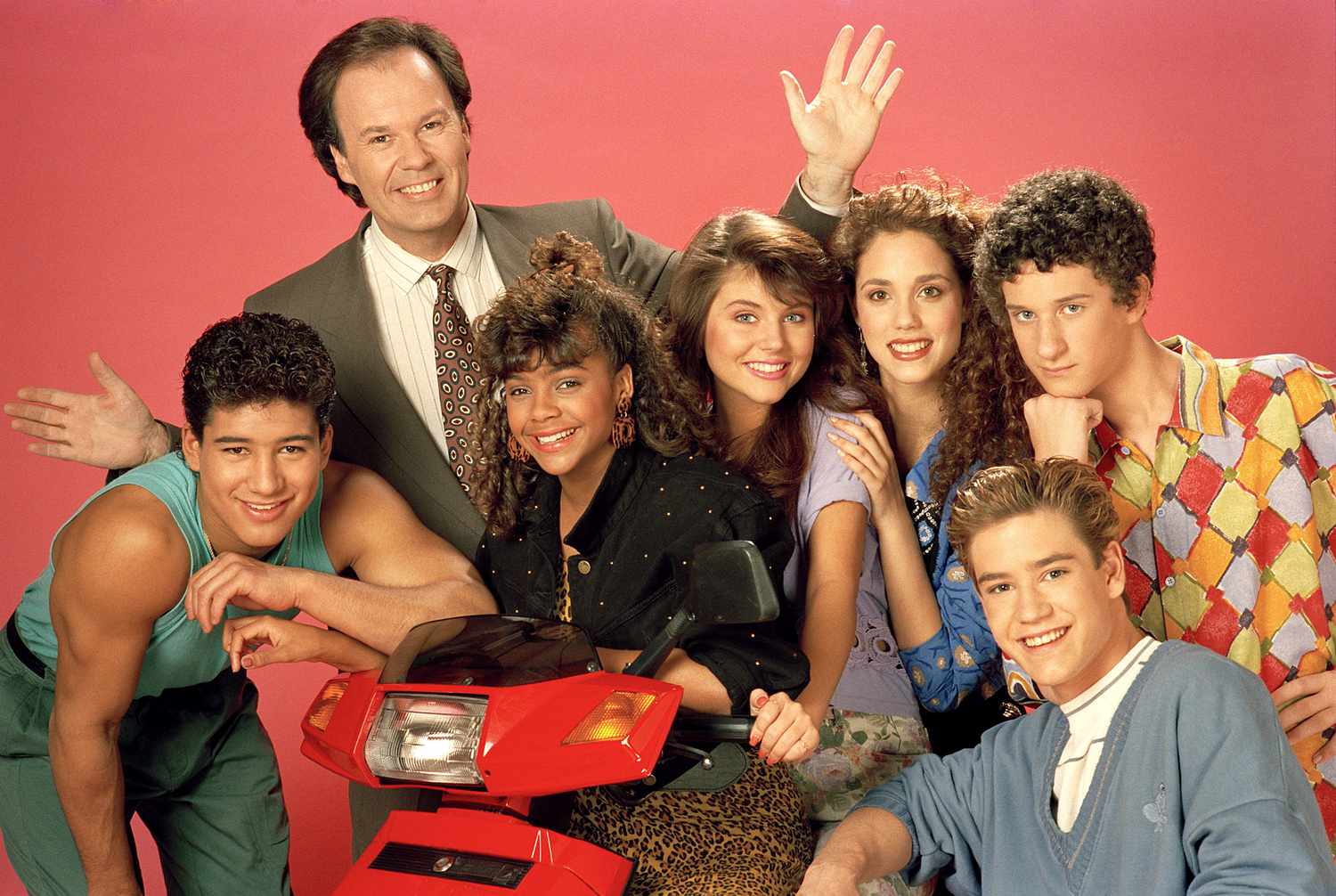
Just a few years ago, gradients were seen as something from a bygone era. Shows like The Fresh Prince of Bel-Air or Saved by the Bell used gradients and those gradients have become signifiers of those time. Gradients were present in software like Windows 95 and 98 and even the sick Word Art that came with Microsoft Word.


I wasn’t alive back then but even so, it seems like these gradients were not considered high brow even if they permeated much of pop culture. Im not sure that that is the case today. It’s hard to tell. In a decade or so we will truly see how gradients are viewed by society but for now, we just have to accept that gradients are part of the contemporary aesthetic. So then the question is, what made gradients suddenly become incorporated into countless apps, websites, advertisements and overall pop culture?
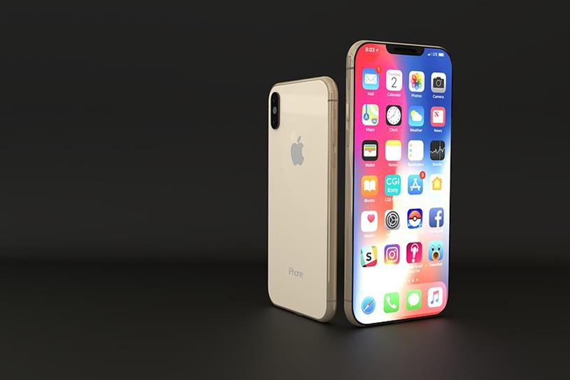
To some degree, gradients mark the abandonment of skeuomorphism (the concept of making digital items resemble their real-world counterparts) and pushing past minimalism and flat design towards a more attention-grabbing (but also calming?) form of design. Skeuomorphism hasn’t completely died, it’s just gone out of fashion in some sense. Even re-designed items like the iPhone’s default app logos still cling to some of its old skeuomorphic designs, it’s just more minimalist and gradient-based.

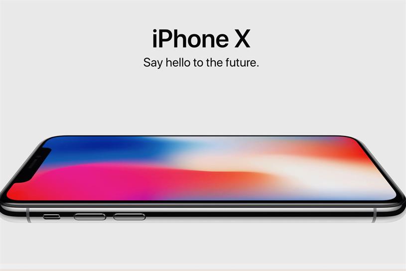
Of the top 20 free apps of 2019, eight incorporated gradients into their logo. For paid apps, it was 10. Nearly half of the top Apple apps of 2019 had gradients in them but that’s just a small part of how gradients have become part of the grand design of technology today. Apple’s entire design and advertisements are based around gradients. Spotify’s too. The New Your Times’ The Daily podcast as well. Huawei has even used it on its phone’s hardware. The list goes on.

But what made it so that gradients were next in the cyclical nature of design? Maybe the emergence of Vaporwave in the early parts of the last decade helped push design towards the more corporate-friendly gradients used by major companies. Vaporwave in itself is also a reiteration of 80s and 90s aesthetic and music. According to Vox, Light and Space and bisexual lighting are also part of the factors that led to the popularity of gradients, and it makes sense. A Venn diagram of these three concepts has gradients in the middle (and maybe cyberpunk).

Look at how bisexually lit Alex Turner is here

Remember when Trump parodied this video on SNL? The fuck was that about?
When companies like Apple and Spotify made gradients part of their design it caught mainstream appeal. Facebook adding gradient status background backgrounds in 2017 pushed it along. As did Instagram ditching its old icon of a realistic Polaroid camera for a flat and gradient-colored icon. Like most trends, this change likely happened as a desire to stand out which then caused others to change to fit in.
It’s hard to say exactly if one type of gradient is ore prevalent over others. When I think of modern gradients what comes to mind is peach- and light blue-colored gradients, oftentimes muted or opaque. Maybe some light shades of red? Looking through Grabient, a tool to create gradients, I feel like this checks out but looking through Webgradients I see every color imaginable.
Who knows if any specific colors will come to characterize this era. Looking at posts like this one about gradients from other decades I agree that maybe those colors are associated with those decades but I also think any of these dated gradients would not look out of place in ads or websites today. The sunset colors that the poster associates with the 80s even closely resemble the colors of Instagram’s current logo. But maybe Instagram was going for something nostalgic?
I decided to look into and write about gradients because I wanted to know why they took off all of a sudden. Part of what I gathered says that it’s just where things were headed after the move towards flat design and minimalism, another part says it’s nostalgia and another says it’s about imitating nature. Still, most parts don’t question it and instead focus on monetizing it. Nice!
There have even been stories about how gradients came about in Trump’s America out of a desire for more tranquil design in such tumultuous times. While I don’t fully buy it—I’m sure gradients would still be around if Clinton was president—I understand the soothing quality of gradients, especially the ones that often resemble nature.
I’m not writing this post with much confidence because it’s a new field to me and because I couldn’t find a clear answer. Gradients’ revival might just be a sign of trends’ natural progression and the cyclical nature of aesthetics. The same way fanny packs are back (this time they go across your chest), gradients are back. We rediscover the appeal of old trends out of a desire to be original and then to fit in. The gradients of today do feel different from those of two decades ago showing that though each generation might readopt trends, they always put their own spin to it. Maybe?
